The occasion for discussion was not only the emblem itself, but also the context in which it appears: the brand's current position in the European market, the transformation of the model lineup, and the attempt to rethink the brand image in the era of electrification.
Symbol of the Era and Its Meaning
Honda's corporate mark with a three-dimensional letter "H" in a frame became a familiar element of the automotive landscape back in the late 1990s. It was associated with engineering rigor, technological independence, and a certain visual confidence. It was under this logo that the brand maintained stable positions in Europe for many years and sold more than 300 thousand vehicles annually.
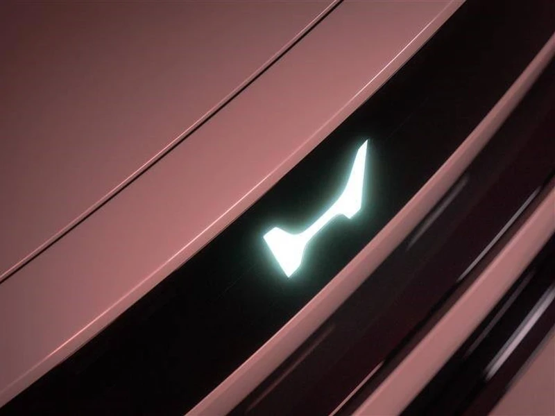
The new emblem abandons the volume and frame, turning the logo into a flat and maximally simplified graphic sign. Formally, this is a step toward modern minimalism and digital universality, but such an approach has already become widespread in the industry and has long ceased to be perceived as innovative.
Context: Market and Model Lineup
The change in visual style occurs against the backdrop of a noticeable weakening of Honda's positions in Europe. In recent years, sales volumes have decreased to approximately 70 thousand vehicles per year. The brand's assortment has become narrower, and the models themselves — noticeably more expensive and less diverse.
The actual sales foundation today is formed by:
- Honda Jazz — as a relatively affordable urban model,
- HR-V and CR-V — due to steady demand for crossovers,
- hybrid versions, supported by the brand's reputation.
At the same time, new projects have not been able to restore previous buyer interest, and the bet on accelerated electrification has not led to the expected growth.
New Logo as an Element of Strategy
The company states that the updated logo will be used starting from 2027 on future electric vehicles and key hybrid models, and then will spread to other business areas. According to the official version, the new sign should reflect Honda's aspiration to create "new value" with an emphasis on electric technologies.
However, the redesign itself is not accompanied by noticeable changes in product policy. The visual transformation turns out to be separated from the substantive one, which reduces its practical effectiveness. In this case, the flat logo becomes not so much a symbol of renewal as a marker of following the general trend.
General Trend in the Industry
Honda is not an exception. In recent years, many automakers have taken a similar path, simplifying their emblems for the sake of universality and digital adaptation. However, market reaction has shown that such changes are rarely perceived as added value and practically do not affect the commercial success of models.
In conditions where key factors remain price, technical specifications, and real consumer benefit, visual adjustments play a secondary role.
Conclusion
Honda's logo change reflects the brand's attempt to fit into a new era, but occurs against the backdrop of prolonged problems with the model lineup and market positioning. The redesign itself is incapable of changing the perception of the brand without parallel steps in product strategy. The ultimate significance of the new symbol will depend not on the form of the emblem, but on what vehicles appear under it in the coming years.